SureCash’s mission is to provide cash management solutions for banks, retailers, and armored carriers, and to offer a digital deposit ticket program that enables retailers to create, print, and monitor bank deposits for cash and checks.
The existing system was built many years ago, was outdated, and had bad UX. Thus, they want to rebuild this system to be more user-friendly, modern, and easily scalable.
My Role
UX Designer, UI Designer
Platforms
Web App Responsive
Used Tools
Figma, Photoshop
Challenges
#1 Redesigning is a challenging process because current users may not like the changes while they got familiar with the existing system. Therefore, the noticeable concern is how to make redesign less painful for users.
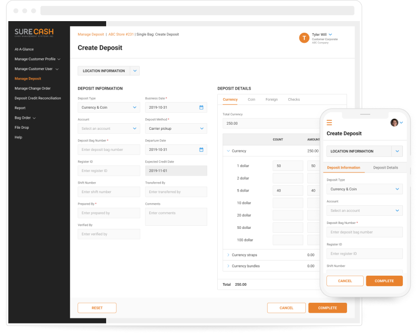
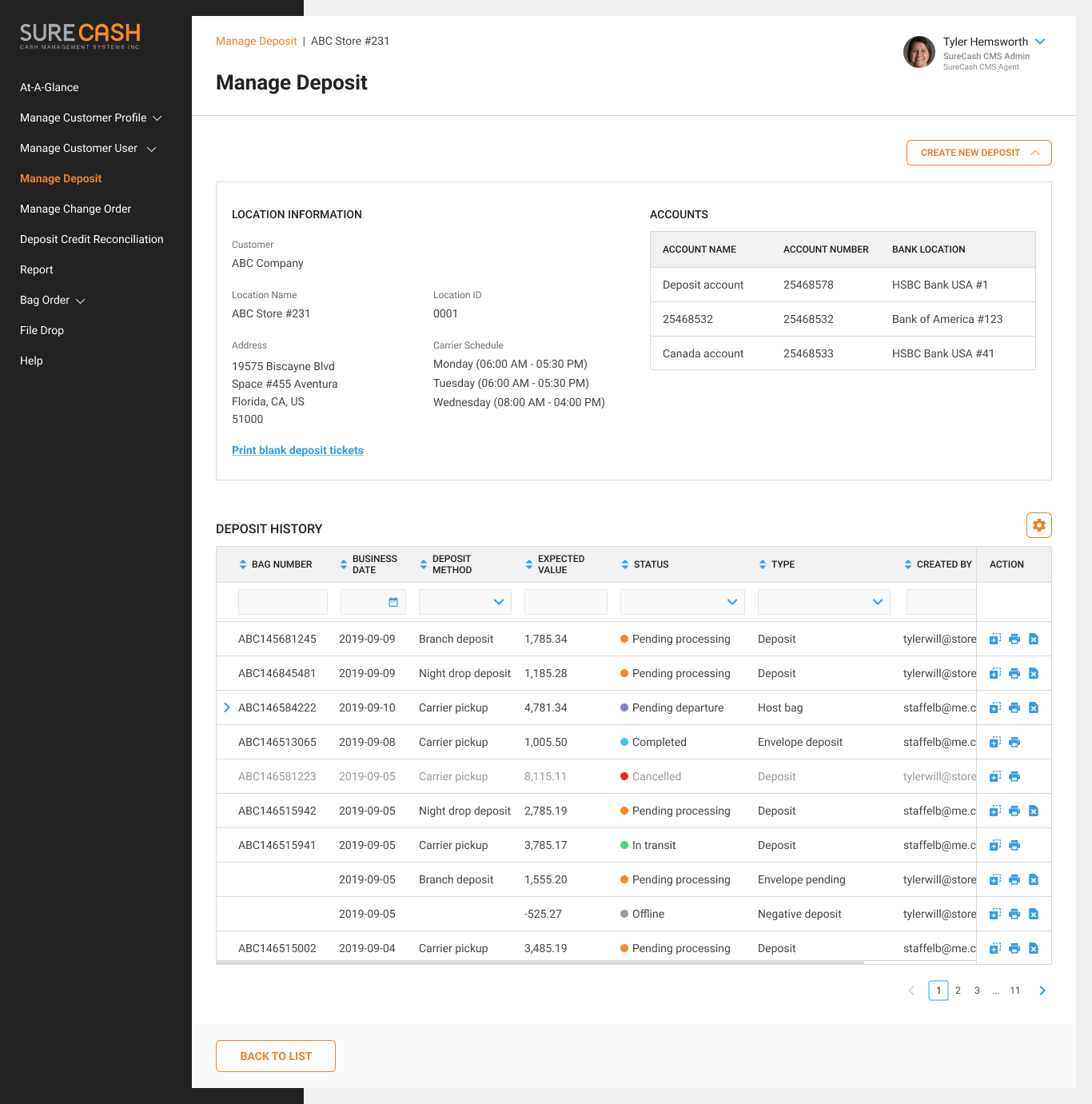
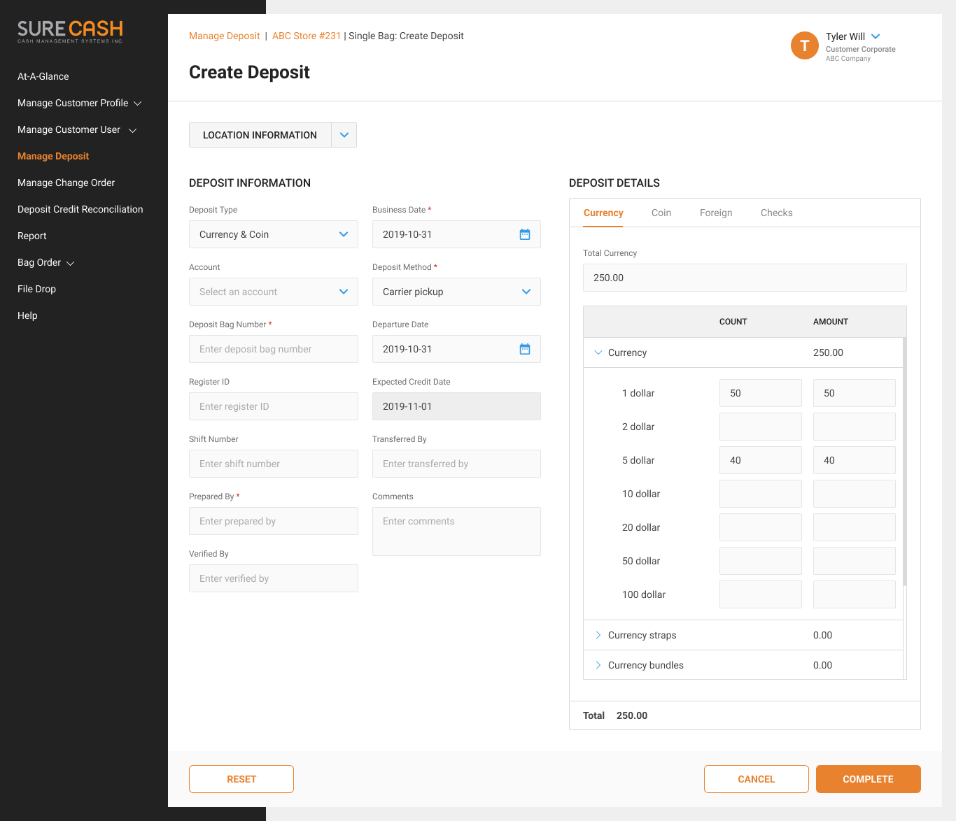
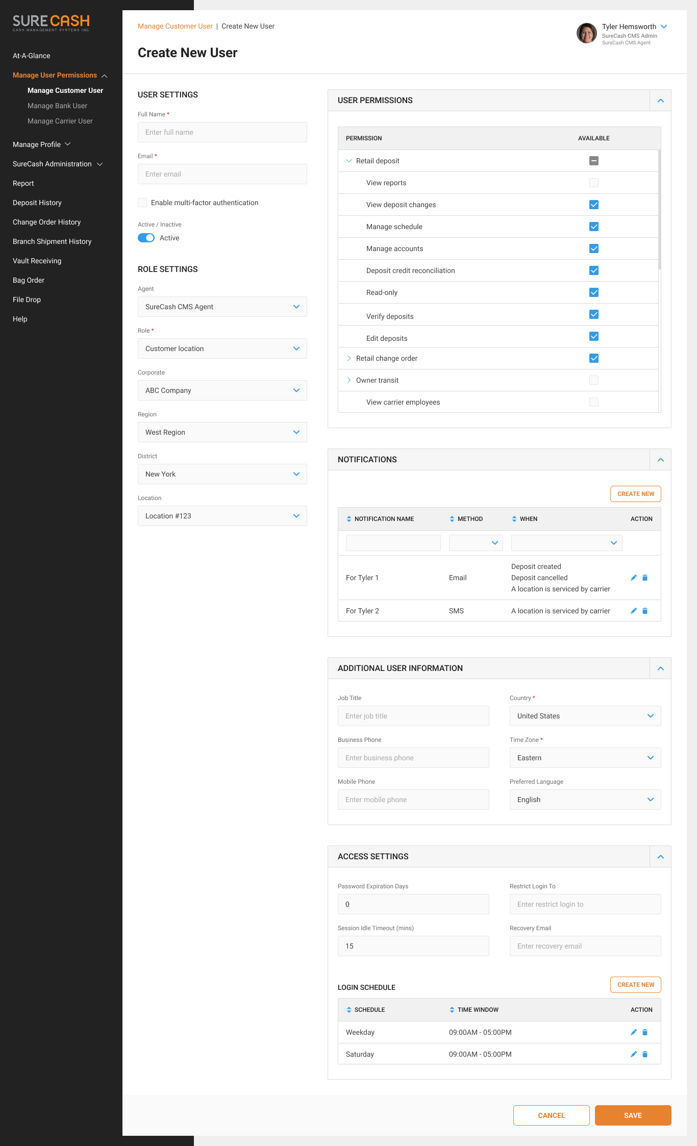
#2 This system is complicated and managed by a complex role and permission system. Besides, some creation processes can have up to a hundred fields. So making an easy-to-understand design with good information architecture is vital.
Design Process
01.
Kick-off Meeting
Create a shared understanding of the project’s background
Come to a mutual agreement on work methods, timeline, and scope of work to ensure everyone is on the same page
02.
Research
Get to know the client and their potential customer groups
Research similar products on the market or websites/applications having similar features
Research design trending, technical involved
03.
Brainstorm
Work closely with the client and business analysts to clarify requirements, identify pain points, and propose respective resolutions
Redefine sitemaps, user roles & permissions matrix, and user flows
Sketch some low-fidelity wireframes if needed and continue to research everything related
04.
Wireframing
Sketch out high-fidelity wireframes
Build simple prototypes to test user flows
Review with the stakeholders, gather their feedback and update the wireframes if needed
05.
UI Option
Set up a mini workshop to brainstorm ideas and create a mood board
Define designs concepts and apply them on some key screens to offer design options
Run review sessions with the client to bring out the final UI style
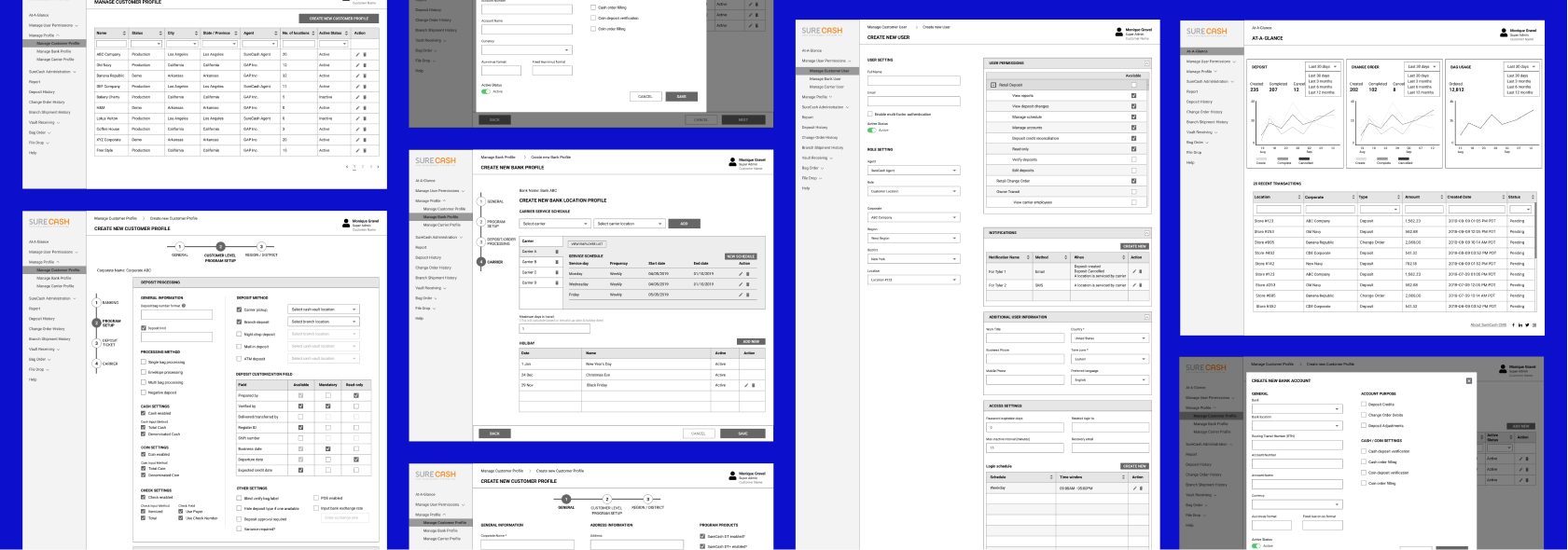
UI Option #1
UI Option #2
06.
Visual Design
Continue with a few improvements to complete the design concept
Create a style guide and a UI components library
Apply the style to the entire project and create essential icons and illustrations
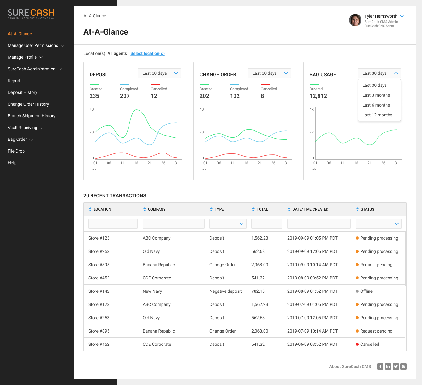
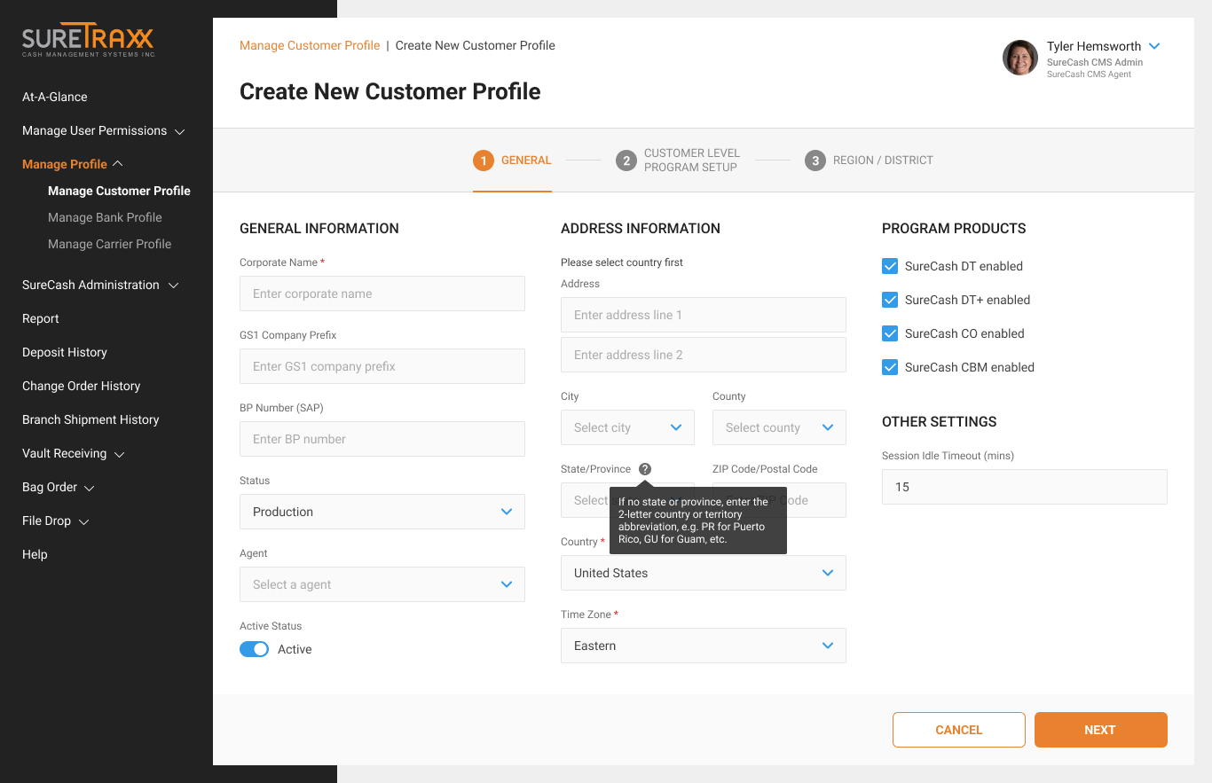
Mockups are scrollable
Previous
Next
How I resolve the problems
#1
How to make redesign less painful for current users.
Know the reasons for the redesign: outdated aesthetics, complex interface
Understand existing users: analytics for an existing product will help understand how users are currently using it, and identify the most significant pain points they encounter based on how long they use it. Some of main pain points are:
Creating data record process (E.g. creating customers, branches, …) is too complicated with a hundred fields without clear instructions
Responding time is terrible without any waiting signal
Users don’t have a strong initial interest in the application
Feedback is crucially important: always prepare yourself for the users’ reaction to the redesign. Remember that any system can’t change immediately, it needs time for it. Try your best and improve it everyday.
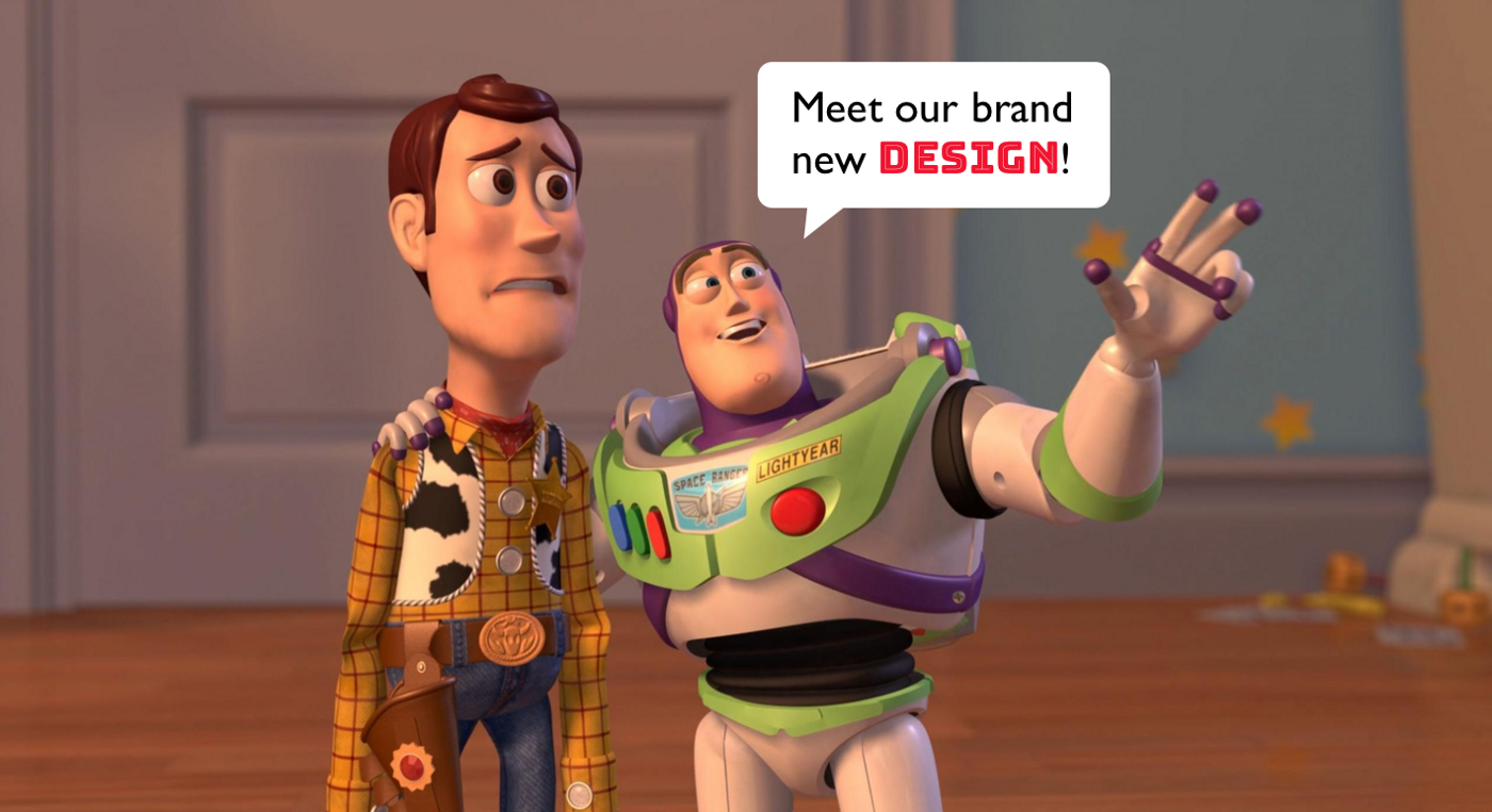
Image credit: toystory.disney.com
#2
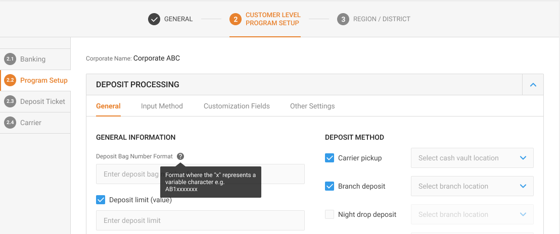
How to deal with very complex forms
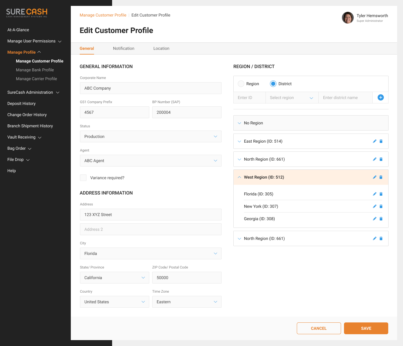
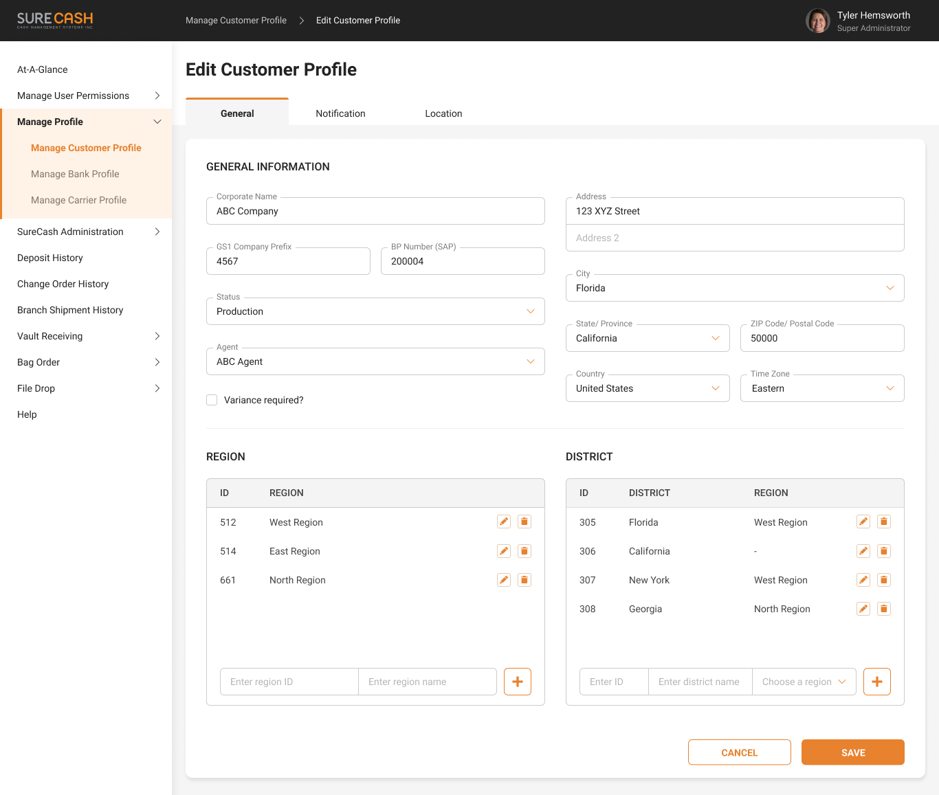
With complicated forms, building a good information architecture is always the best preparation. For me, I usually use two basic concepts to organize information:
Classification: used to join related information together;
Hierarchy: used to sort information – according to its importance, frequency, alphabetically, numerically, or last seen.
Image credit: justinmind.com
After that, we transform the organized information into suitable elements which follow three principles:
Grouping: ensure that users can easily recognize which fields belong to which group and distinguish the boundary area of each group. Spacing is one of the best ways to do that.
Hierarchy: there are many levels of information in one group, so make sure users can recognize these levels. It’s helpful for users to locate and find the information they need faster. To achieve this, we can use font size, font weight, color, etc.
Consistency: it’s a bad UX if you use different components to present the same type of information. Easy for you is easy for users.
And here are some components I used:
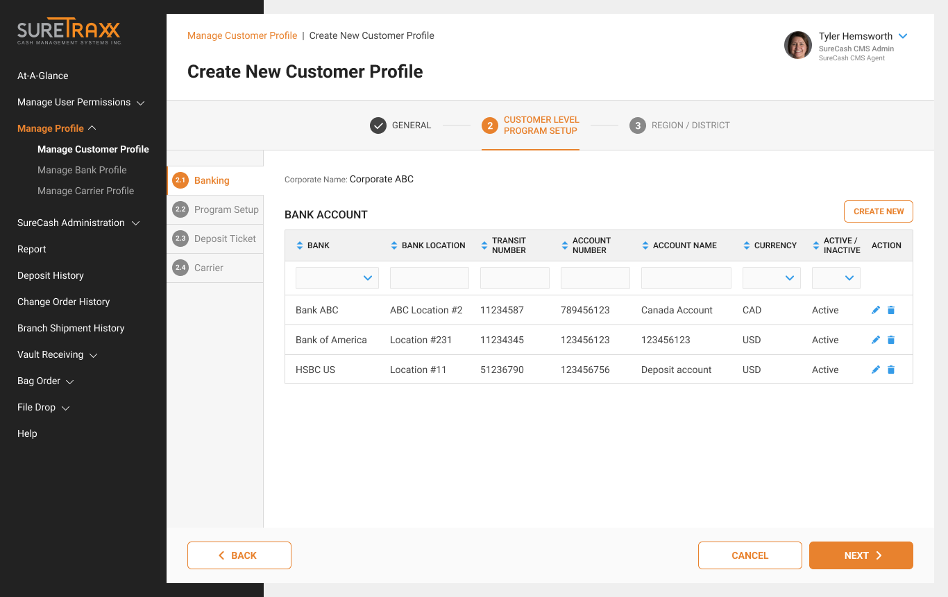
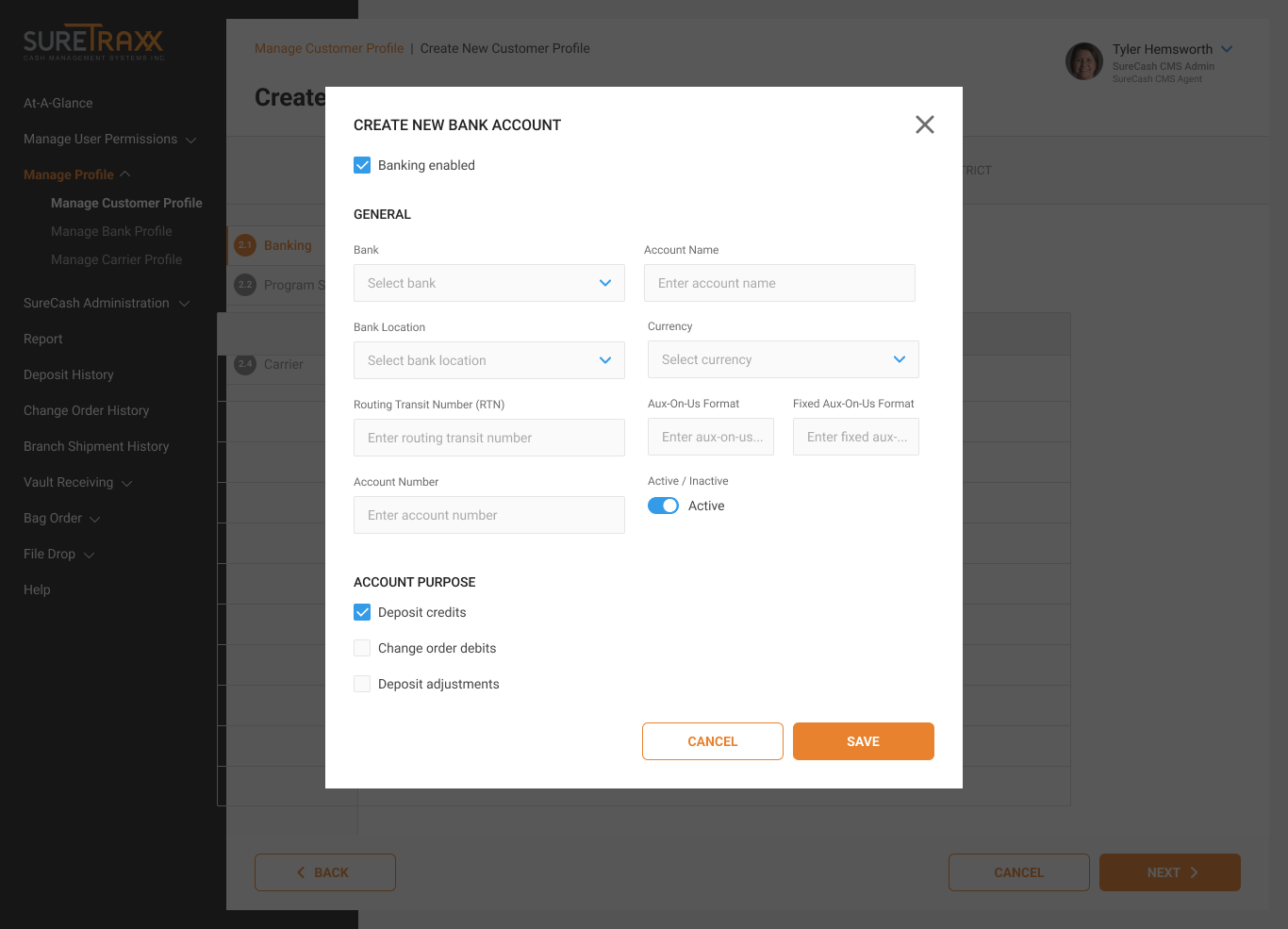
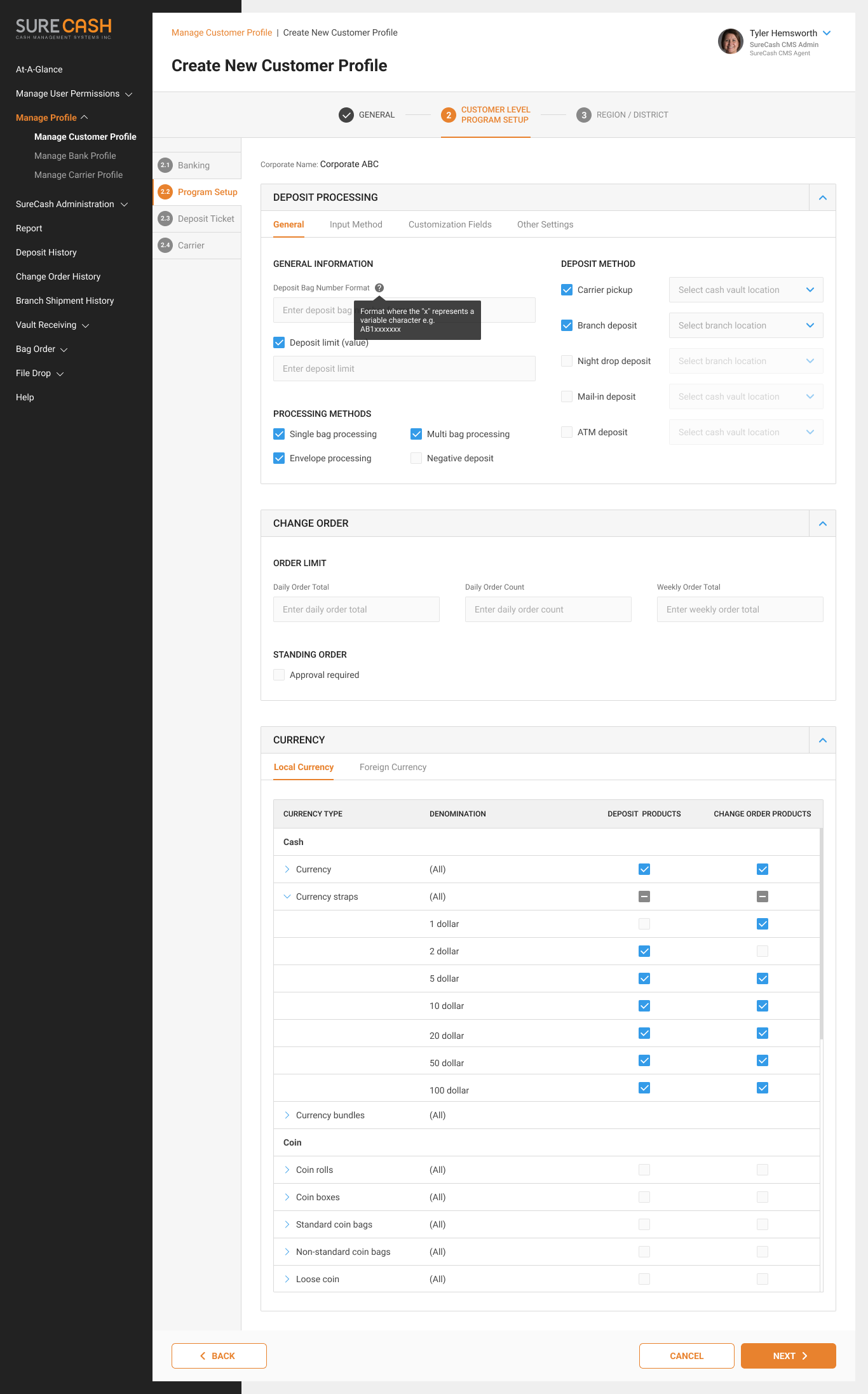
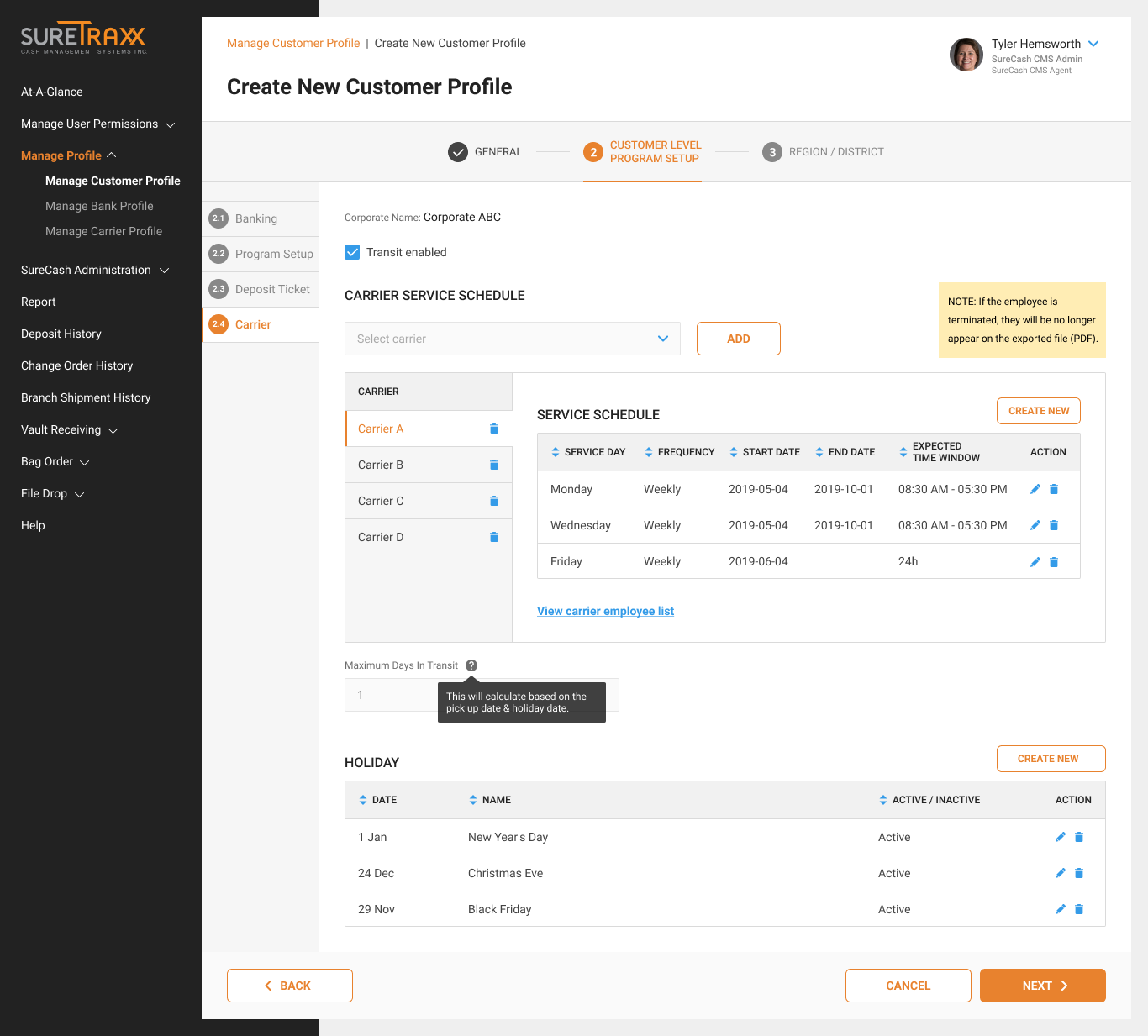
Step: Instead of a single step making users exhausted in the current system, we split it into multiple steps. And how to present them effectively:
Cluster similar questions: Multi-step forms work best when similar question types are clustered together. This keeps the user’s mind focused on one area of data and reduces cognitive overload.
Easy before hard: don’t begin your form with a 1,000-word essay question. Something easy to start with. There’s a reason that 99.999999999% of forms begin by asking for your name.
Allow the user to move back and forth between steps
Progress bars are one of the most potent weapons in your armory when it comes to driving multi-step form completions.
Collapsible section: only used for less important and unrequired information. This helps reduce the length of the page and can be less intimidating to the user.
Tab: only use when users don’t need to see content from multiple tabs simultaneously and remember to logically chunk the content behind the tabs so users can easily predict what they’ll find when they select a given tab.
Fieldset: try to avoid multiple columns in a single fieldset, because this breaks the eye flow and workflow.